Lueur's Playtest Analysis
The first playtest for Lueur lasted 10 days with over 40 participants. What can I get from it ?
All links to products are affiliated link, you pay the same price and I get a small percentage, thanks for your support!Posted on December 17, 2022 · 15 minutes read
Introduction
I organized my first playtest for Lueur, a minimalist strategy game. In this post I would like to share the results and how I use them to improve the game, hoping to inspire you for your next playtests. I'm no statistician or expert in data analysis, so I'll keep things simple and intuitive.
Here are some things to know about the 46 playtesters who participated :
- 58% of them are game developers.
- 52% of them usually play strategy/management games.
- 26% of them know me personally.
- 22 of them played a "version 1" of the game, 24 played a supposedly improved "version 2".
This means :
- With only 46 testers, I can't extrapolate the results to the whole player base. But I can still make some conclusions about this sample.
- My results might be strongly biased (more about this at the end of the article).
Closed questions analysis
Did you have a good time ? How fun was it to play Lueur ?
Let's look at the enjoyment and fun. It's basically how much they liked Lueur.
This is a very important question to ask as it will guide me in analyzing the feedback.
People who rated 1/4 do not like the game and it will be hard/impossible to change that. People who rated 2/4 could come to like the game with appropriate changes. People who rated 3/4 liked the game, and could come to really love it with appropriate changes. People who rated 4/4 really loved the the game, I need to be careful not to loose them with inappropriate changes.
That being said, I want to focus my intention on feedback from 2/4 and 3/4 ratings to improve the game.
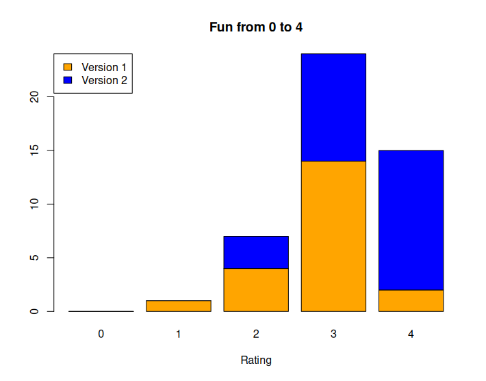
Analysis : Seems like the version 2 brought better ratings than version 1
Takeaways : Adding the better difficulty and tutorial improved the experience
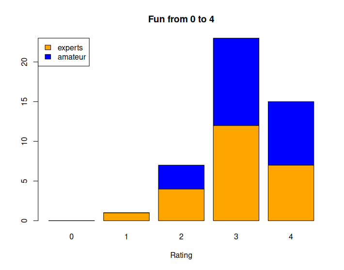
Analysis : The expertise does not seem to influence the fun.
Takeaways : On the good track ! I was expecting experts to be bored faster and as such enjoy the game less. As Lueur is aiming for both experts and beginners, that's great. Important to note that I still got frustrations about the game not being complex enough.
Would you buy the final game for 8$ ?
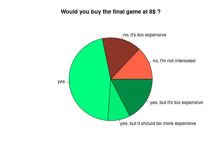
Analysis : People could put a custom answer, I regrouped them. A large portion of players are ready to buy the game at this price.
Takeaways : A final price of 7.99$ will be good for 60% of the players. Of course some players are not interested in the game (here 15%) and I can't really do something about that. The remaining will buy the game during promotions which are bound to happen. It's also good to know that expert players have the same distribution. I was afraid more experts would not buy the game or find it too expensive compared to other strategy games.
Which game mode did you play ?
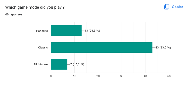 Analysis : Most players played the classic mod. Looking deeper, I discovered that almost all the players who played the other gamemodes were experts. And I noticed in the comments that most of them actually played peaceful after classic, just to try.
Takeaways : No surprises here, the classic mode is the way to go for most people. They are still some people interested in the other game modes. I think more people will play the other game modes after buying the game.
What do you think of the level duration ?
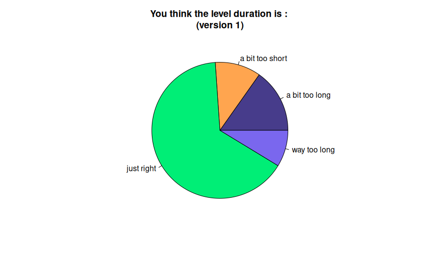
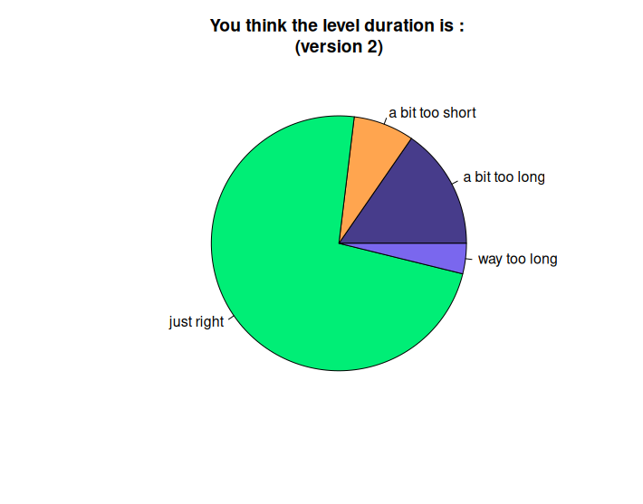
Analysis : Most people think it's just right or maybe a bit too long or short. A few people think it's way too long in version 1. We can see the version 2 improved the results. The expertise does not change the results.
Takeaways : Lueur needs to be a short game. You don't need to save, and you can quickly play a level for 30 minutes or so and be done with it. I'm happy to see most people are ok with this duration. The skip day button from version 2 might be the key improvement here.
Would you play again to complete the optional challenges ?
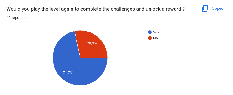
Analysis : 70% of players would play again.
Takeaways : I expected more people to not care about optional challenges. That's good news since I really want the challenges to be part of the game experience.
Which reward would you prefer ?
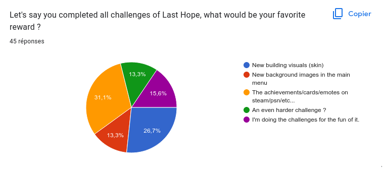
Analysis : Achievements and Skins are in front.
Takeaways : Achievements/Card/Emotes are gonna be done anyway, so that's a good thing. Make new skins for some buildings won't be too costly so I'm gonna do it too. I'll pass on harder challenges and new menu background image which were not my favorites in the first place.
Was the game simple to understand ?
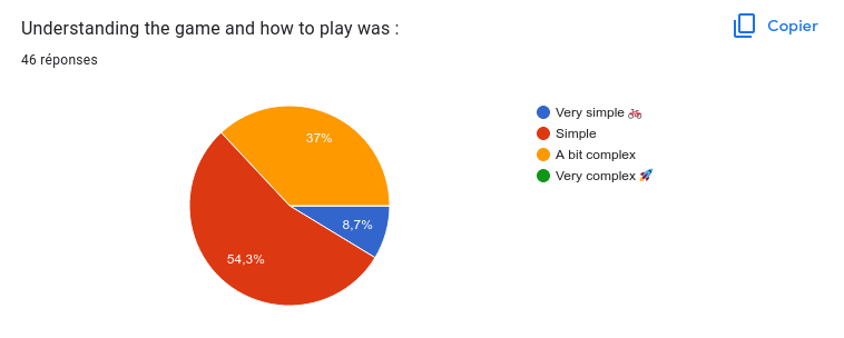
Analysis : Most people thing the game is very simple to understand. But a fair amount think it's a bit complex.
Takeaways : The game is very simple, so that's a given most players will find it simple. I think it was still a bit complex for some because of 3 reasons :
- The UI is not the most readable
- The low resolution sprites can be hard to read
- The tutorial is very light
How much do you like the music ?
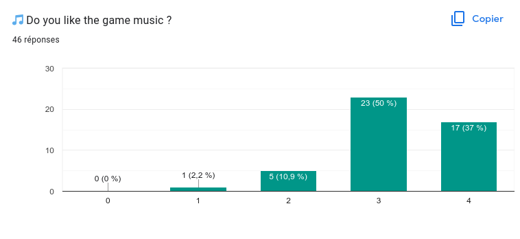
Analysis : The music is very appreciated.
Takeaways : Really surprised by the result considering it's a 40 second loop. I think most the 3/4s come from the lack of diversity. I'll make a longer music loop, but I'll keep the same minimalist sad piano style which seems to be very liked.
How much do you like the sounds ?
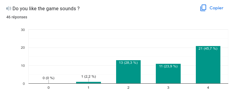
Analysis : Sounds are mostly liked but a fair share of people are still neutral about it.
Takeaways : Overall players really liked the idea of having different environment sounds on each tile type. But some of the sounds were too loud, inappropriate or annoying which led to lower ratings.
How much do you like the graphics ?
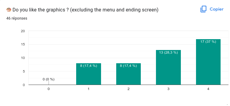
Analysis : There is a large portion of bad or neutral ratings. Seems like a subjective question.
Takeaways : It's pixel art, not everyone likes pixel art. Moreover, it's very low resolution pixel art, which is even more niche. Knowing this, these are pretty good results, way better than I expected. I'm working on more detailed visuals and I think it's gonna help make the game grasps a bigger audience, especially amateur players.
How hard is the game ?
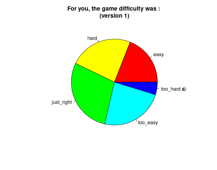
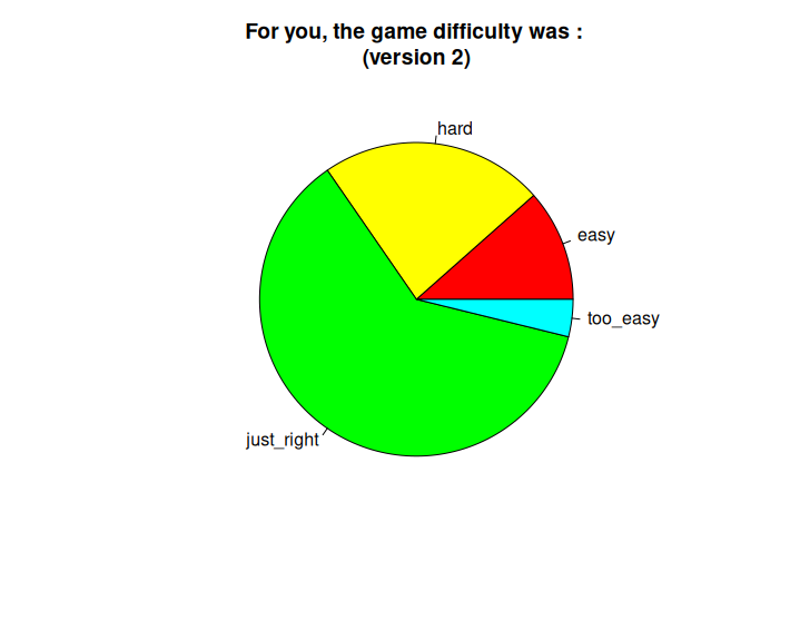
Analysis : Results are all over the place in version 1. It gets better in version 2, with almost everyone between easy and hard (but not too much).
Takeaways : This is hard to measure since some people will crush the game first try and others will need a few tries to barely win. But It seems like the current difficulty level added in version 2 is very good so far. I'm gonna keep this difficulty and add a secondary objective to complete the level faster for very good players. But I like when the player wins the first game, so I might add dynamic difficulty to help the less skilled players win.
Did you get bored at some point ?
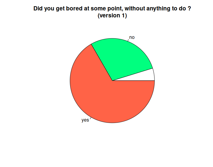
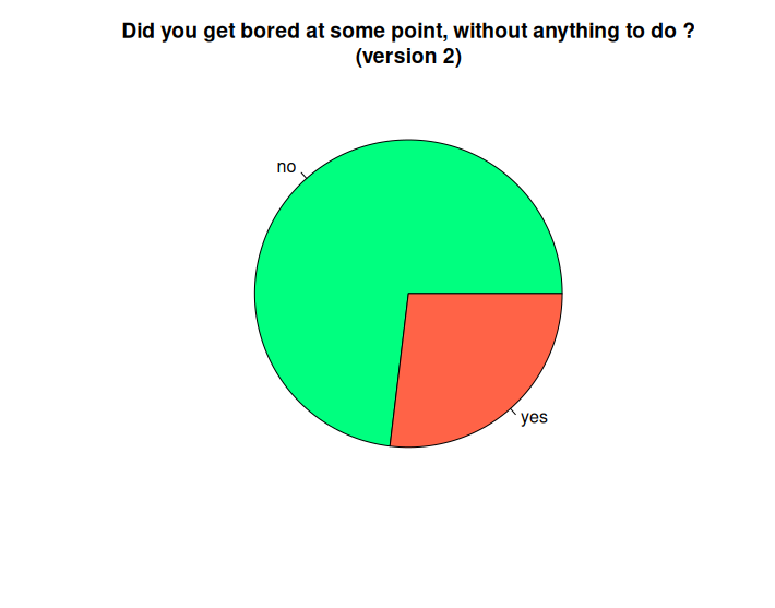
Analysis : Almost 70% of players got bored during version 1. Version 2 did way better, but still 30% of them got bored at some point.
Takeaways : I'm happy to see that the skip day button/quests/difficulty changes in version 2 really helped. But there are still a lot of people who got bored. I verified and those are people that rated fun 2 or below. I think it comes from the end game and the waves. In the end game, you don't have much more stuff to discover and explore, you mainly just survive. Resisting a wave is not interesting enough too. Tactical choices are kind of limited. I need to add new things to explore in the end game, and to add a new way to fight off darkness as well as new ways for darkness to attack.
Analyze of the comments
I read through all of the comments, and regrouped them in 3 groups : Dislikes, Likes and Wishes.
You can find below the different groups, with my notes about each point.
Top dislikes
| count | feedback | solution |
|---|---|---|
| 13 | descriptions for buildings/upgrade/research | Maybe I need to add a very concise description somewhere. OR find a way to make them understand without descriptions. OR remove things that are not clear. |
| 11 | not enough tutorial would have like something somewhere to say building in dark do not produce | Related to the problem above I think. Because the tutorial seems ok. But it’s true that is it lacking in information about darkness |
| 6 | move to the border to find red darkness/hard to find darkness | I will add an arrow showing the direction of the last red darkness (disappears after a few seconds) |
| 6 | not enough buildings and upgrades | I have a few ideas for new buildings. Basically, upgrades for every building but it will consumes resources. |
| 5 | waiting for the end of the day for resources | fixed with skip day |
| 5 | Not enough ways to fight off darkness | It was kind of the point tbh. The only thing you can do is produce resources and consume it. What could I add for more tactical choice ? A darkness hole ? Once destroyed, darkness around is cleared and darkness strengh lowers ? A stronger illuminate that illuminates adjacents cells ? A building or action that clears one random cell (upgrade light crater) A building that reduce the price of illuminating around or on it A building that stop darkness but get destroyed in the process Heart of darkness who spawn during wave and you can destroy it to reduce wave power |
| 4 | more than one action in the action wheel | YES ok I’m gonna do it |
| 4 | skip intro button | Alright I’ll do it |
| 4 | did not see the upgrades on buildings,hard to see and hard to know if there is more | Might be partially fixed by the bigger action wheel. Should I add a little “Arrow Up” icon on upgradable buildings when you have the funds ? But player could believe it is always the better choice |
| 4 | too easy | let’s ignore this one because of v1 and v2 |
| 4 | can’t get enough resources fast enough | let’s ignore, it’s just because of balancing and no skip day button |
| 4 | desert/treasure are frustrating | maybe I should stop putting chest in deserts only. But I think it’s gonna be fixed with the new visuals. |
| 4 | hard to see darkness | kinda fix but need more brightness |
| 3 | too easy at the end | will be fixed by introducing new ways to fight darkness and rebalancing the stuff |
| 3 | hard to see if a building is buildable or not | the transparency alone might not be enough, but in dark it might invisible hard to see the icon. Put the whole text in gray too ? |
| 3 | lighthouse placement is confusing | I shoud remove the constraint, church is actually stronger |
| 3 | would love generated map | yeah will see |
| 3 | not enough music variation | will make a longer loop in the same style |
| 3 | Pacing (1 slow and rythme cassé pendant vague) | that’s actually because 1. no skip day button 2. you don’t really have aynthing to do during waves. |
| 2 | day counter not explicit enough (see seconds) | make a more detailed clock where you can clearly see the aiguille turn |
| 2 | Don’t like inconsistent pixel size | do I care ? I will try from now on but that’s ok. |
| 2 | no keymapping in options | Yes it’s actually important to be able to remap for accessibility and all |
| 2 | encylopedia | not really sure I want to do it |
| 2 | hold button to move | yes will do |
| 2 | option menu in pause | YES |
| 2 | did not understood how darkness worked/spread | I won´t explain |
| 2 | disable tuto | the tuto is actually the quests so… |
| 2 | thought light crater were one use only | kinda same problem with trader. Do I need a cooldown ui ? |
| 2 | thought the hut would be automatically upgraded | will be fixed if I add a description I think or upgrade icon |
| 2 | darkness price | fixed |
| 2 | once the wave attack, you take less time to understand things | I don’t think I can put it later. I don’t think it’s a problem, you’ll discover things at the second game |
| 2 | disliked humhum sound | yeah I need to find a replacement |
| 1 | screen flashes and shaking can bother some people | add option in menus |
| 1 | did not get the illuminate mechanic | |
| 1 | felt unbalanced with too much RNG (lumberjack and fishing cabin placement) | |
| 1 | more sounds variants | maybe on some of them that you hear very often ? Or maybe the stream should start at a random point in the sound ? |
| 1 | trader not understood | same as crater, do I need a cooldown icon ? Or description will do ? |
| 1 | campment name not clear | not proper english |
| 1 | hard to complete the challenges | They are optionnal so that’s the point and not a worry |
| 1 | cursor slugish | Optimisation to do (HUD) |
| 1 | with game pad, the select button icon is not clear | replace it with B instead ? NO because you can’t PAUSE in choice wheel. Actually need to remap start to a special pause button. Maybe make a higher resolution button ? |
| 1 | nightmare too hard | will be reabalanced at some point, but it has to be very hard |
| 1 | huts and fishing huts are confusing names | huts become tents |
| 1 | did not understand that tree regrow and sheeps breed | will be in tutorials and descriptions |
| 1 | defeat conditions are not clear | Remind each time that you need to protect the castle during the wave |
| 1 | remove tuto in nightmare | yes it wil be |
| 1 | did not understand the adacency bonus | will be more clear with descriptions |
| 1 | escape key too far away from space | maybe remap it to maj or ctrl ? |
| 1 | woud like to pause the game to think | hated fast days at the start. But if you can take your time the game might become way too easy |
| 1 | was wondering if people eat food ??/ | |
| 1 | game over make you restart automatically | need to suggest restart or back to menu |
| 1 | red number == can’t | need to make a better UI to know if you can or cannot build. Put emphasis on the ressources you have and don´t have. |
| 1 | day change is not marked enough | The clock needs to grow up each day and have a special sfx |
| 1 | illuminate cost should be visible without clicking | will be visible thanks to darkness strengh ? Not sure |
| 1 | woud like to know how much I can get back when clearing darkness | modifydescriptions to see what’s below the rampant darkness ? Not sure I want to do that. |
| 1 | did not notice wave timer in the quest | not gonna change that. |
| 1 | no exciting actions | what kind of mini game could I add ? LUMIEREs ! Critical. Launched a mini game sometimes ? |
| 1 | some unpleasnat sfx (sawmill) | maybe I can lower it and make it less aggressive ? |
| 1 | uninteresting art style | |
| 1 | failing challenge by accident | he wants a mod to activate the challenge so that you can’t make it by mistake. Huuuuuh. |
| 1 | slow | feedback was for v1 (before skip turn) |
| 1 | crt filter | you can deactivate it |
| 1 | same map | other maps coming |
| 1 | price increase on darkness is not explained | true, I need to find some excuse. Maybe a darkness strengh or something |
| 1 | destroyed by mistake | hummmm it would make an exception to my action system, don’t really like it. Maybe I should just remove destroy from the light crater ? |
| 1 | hard to read | |
| 1 | darkness workings confusion | do I want to explain it ? |
Top likes
| count | feedback | solution |
|---|---|---|
| 14 | Mood | I need to be careful not to destroy that mood with later updates |
| 11 | music | Will make the music longer but in the same style |
| 7 | exploration and discovery | Can I add more stuff to discover ? Abandonned buildings ? (already built on the map and ready to use) Darkness cult church ? Curiosities ? (? on interesting darkness cells) |
| 7 | controls feels good and are intuitive | I need to stick to those simple controls |
| 6 | "real-time, but tick-based" | Key pillar, gonna keep that |
| 6 | Gameflow/pace | Still some problem during waves though |
| 6 | sfx on each tiles | |
| 5 | lowrez pixel art | Hope the change won’t hurt that |
| 5 | Sound design | |
| 4 | UI | |
| 4 | minimalism | |
| 3 | most things in the game were very easy to understand | great, but at the same time if I add descriptions… |
| 3 | challenges | |
| 3 | challenging | |
| 3 | Map reveal at the end | |
| 3 | Visual style | |
| 3 | gameplay | |
| 2 | Quests | |
| 2 | clear pixel art | |
| 2 | adjacency mechanics | |
| 2 | Nice tuto | |
| 2 | Aesthetic | |
| 2 | Skip day button | |
| 1 | micromanaging in the market | |
| 1 | gamemodes | |
| 1 | chill | new visuals will help feel more cozy |
| 1 | optimizing buildings | maybe I can add more ways to optimize placements ? building that boosts boosters ? |
| 1 | distinctive art style | |
| 1 | game feel | |
| 1 | abilities in buildings | can I add more abilities ? Override ? Food boost ? |
| 1 | Crt filter | |
| 1 | City Building | |
| 1 | Menu | |
| 1 | Short integrated Tutorial | |
| 1 | Crater which gives light from time to time | |
| 1 | Change in music pitch in wave | |
| 1 | Screen effect on wave | |
| 1 | would love to see a speedrun | |
| 1 | liked that everything is not exposed |
Wishes
| count | feedback | solution |
|---|---|---|
| 4 | more worldbuilding | Starting cinematics Narrative hints ? Maybe you can find those in chests or abandonned buildings ? Maybe some narrative can be told when finding things for the first time ? |
| 3 | Goal/Impact explanations | The intro will help. The ending should be more explicit. You built the first city of light in this darkness age. Now the road opens up for more. |
| 2 | would like to plant trees | Trees are things out of the player control (and that’s cool). But it’s intuitive to be able to grow them back. An action that costs a lot of food to regrow a forest on a meadow tile faster ? |
| 1 | “big moments” | each wave should be a big moment |
| 1 | better pacing | the skip day helped with that, difficulty too |
| 1 | things to do outside buildings | see the minigames idea |
| 1 | endless mod | It’s doable |
| 1 | more levels | in progress |
| 1 | Different ways for darkness to be a threat | eyes of darkness ? |
| 1 | loop button menus | nth |
| 1 | would like building to use diagonals | maybe the upgrades can ? |
| 1 | Intro cinematic to explain the game | gonna be done |
| 1 | button to display a”production view” | aaaah not sure about that |
Fun Biases
Let's review some of the biases and other things that could make this data less reliable. To be honest I just looked at them for fun and I'm not sure it's that useful.
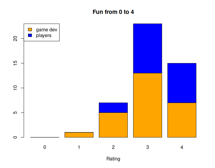
Are game devs harsher than players ?
Half of the players are game developers, naturally biased because of their job. They do give more precise feedback. They also tend to analyse the game instead of simply playing it. You need to be careful when reading their feedback as they are more likely to give solutions to problems they analyzed but not necessarily experienced during their session. I had a few feedback telling me "this is really bad for players, you need to remove it" while the "players" actually liked it most of the time.
Because of that, we could think they are harsher than players ?
They are the bulk of 2/4 and 1/4 that's true. But most of them are around 3/4 and 4/4, in equal proportion with the non game devs. We can't really say they are harsher and it seems it might not have biased the test too much.
Are my friends too kind ?
26% of the players were "friends". By friend I mean any persons that knows me personally and talked with me a few times. Surely it must bias the results ?

A funny thing to observe on this sample is that the closer the friend, the lower the rating. Also, 50% of the 2/4 ratings are from my friends. So, they definitely weren't too kind. Their mean rating is also lower which suggests they were actually a bit harsher.
Things I should have done in the survey
Ask : Which controller did you use ? - Gamepad - Keyboard
What do you think of the controls ? not good 1-5 good
Remove :
"What is missing from the game ? " got similar answers that "something you disliked"
One important thing I learned
Some people are convinced that something in your game is completely wrong. But if you find others that are convinced it's not, then you have on your hands a subjective choice. There won´t be a good answer. You can go with the majority to please more players, or go with your initial idea to stay true to your intentions.